Feature development in legacy product
From All-or-Nothing
to Selective Control
Redesigning download workflows for a construction tech product that gives field workers control over device storage without interrupting work on site.

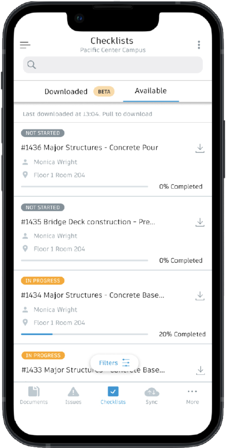
Project Overview
Challenge
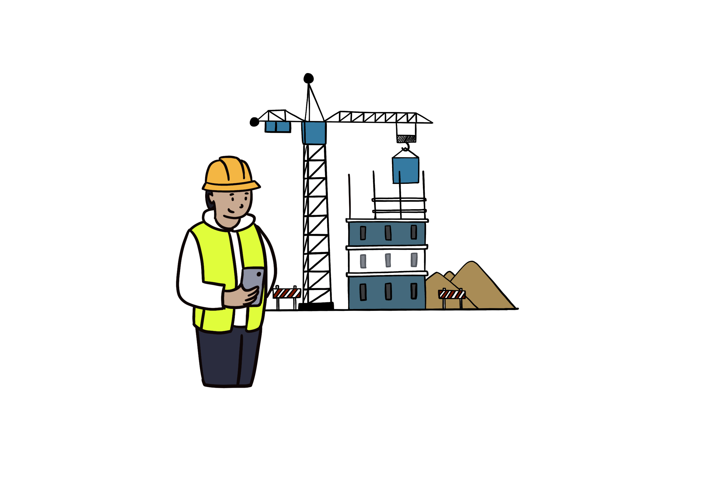
Field workers on construction sites need offline access to checklists within the Checklist product. Downloading an entire project meant pulling 5,000+ items, images, and video to a mobile device. The storage load caused lag, sync failures, and broken workflows at exactly the moment workers needed the app to be reliable.
Approach
Led discovery and research to identify the root cause, then designed and tested a selective download system — giving users control over what they stored locally rather than forcing an all-or-nothing download.
Outcome
Download time reduced by 70–80%. Storage consumption reduced by 60–65%. The solution was adopted as a model approach and presented to other Centers of Excellence across the organization, who faced similar challenges.
Problem Discovery
Uncovering critical limitations faced by site managers on construction sites
Construction companies rely heavily on documentation and checklists to ensure safety, quality, and compliance. As the industry digitises these traditionally paper-based processes, new challenges emerge in managing the vast amount of data generated across construction sites.
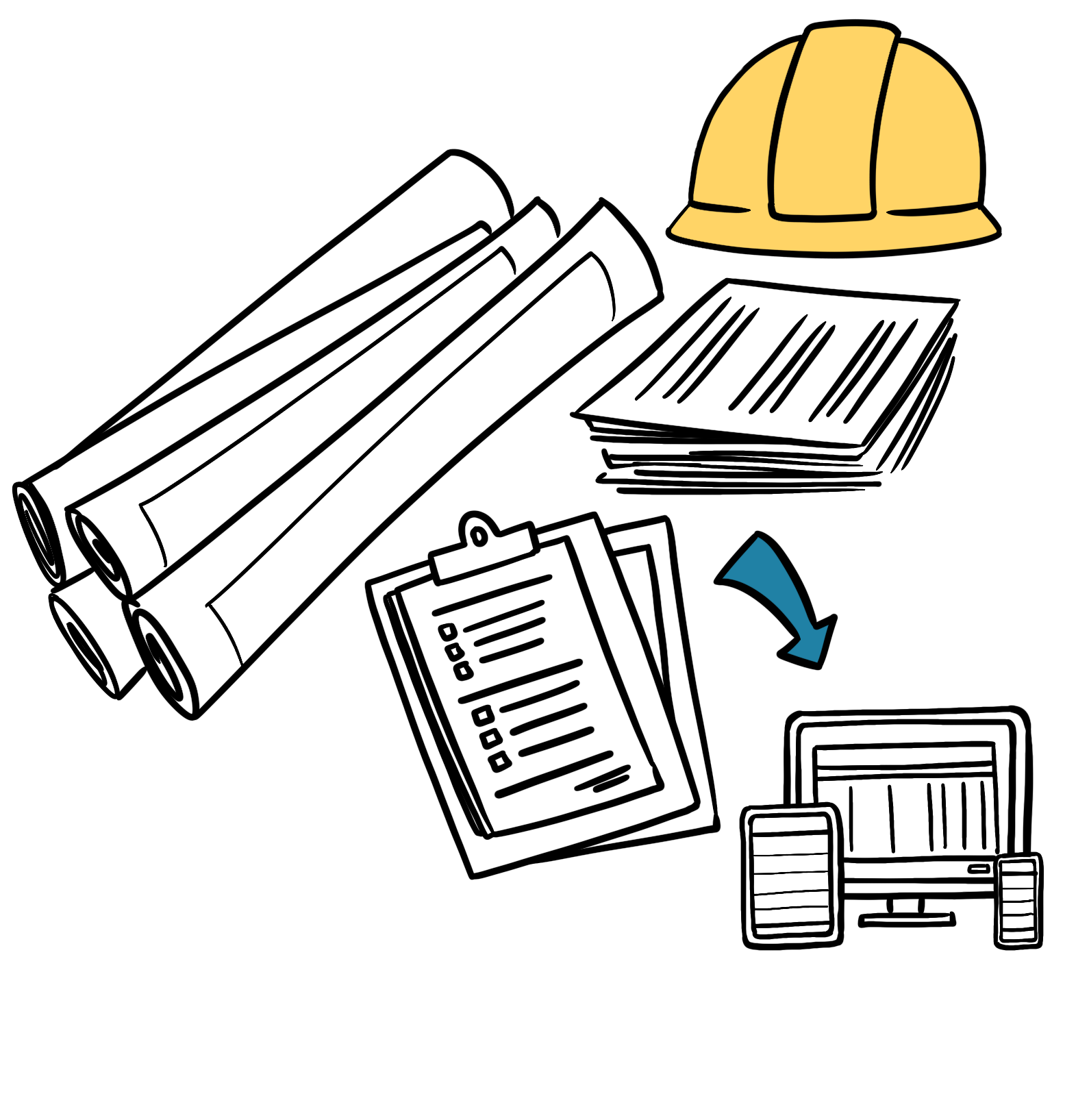
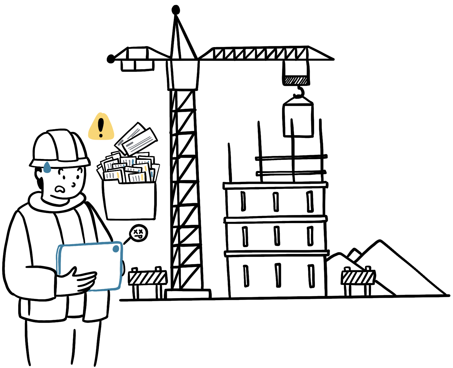
On a device already under load, that caused app lag, sync failures, and lost data — in environments where there was no network to fall back on.
Findings
We discovered the direct correlation between large project sizes (5,000+ checklists) and app performance degradation
Insights
User-centered priority: Enable seamless on-site inspections
Design objective
reliability
and reliability
discoverability
Create a lightweight access to heavy documentation
Let users filter, select, and download only the checklists relevant to their immediate work
Solution
Approach: Meta-data first, details on demand
Instead of downloading entire projects, the new model worked in two stages:
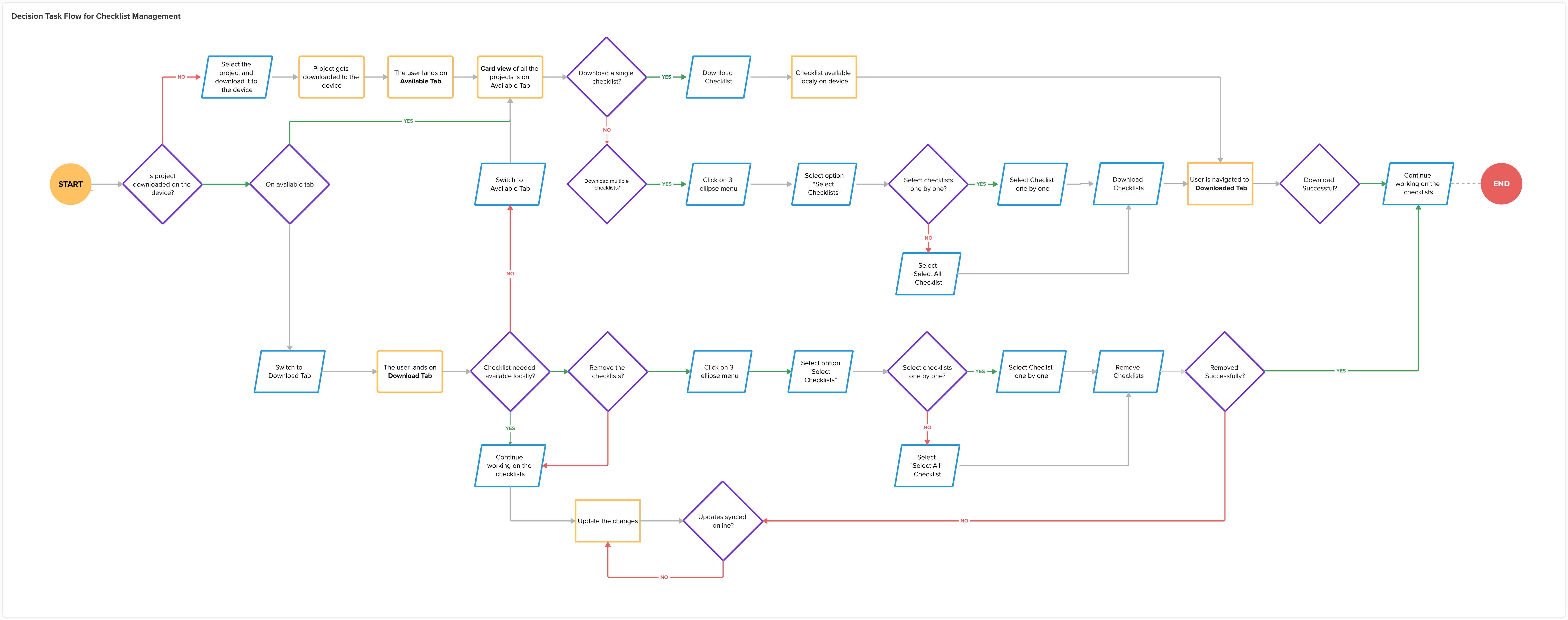
Stage 1: Download the project with all checklists meta-data only
Stage 2: Selectively download checklists required for active work session
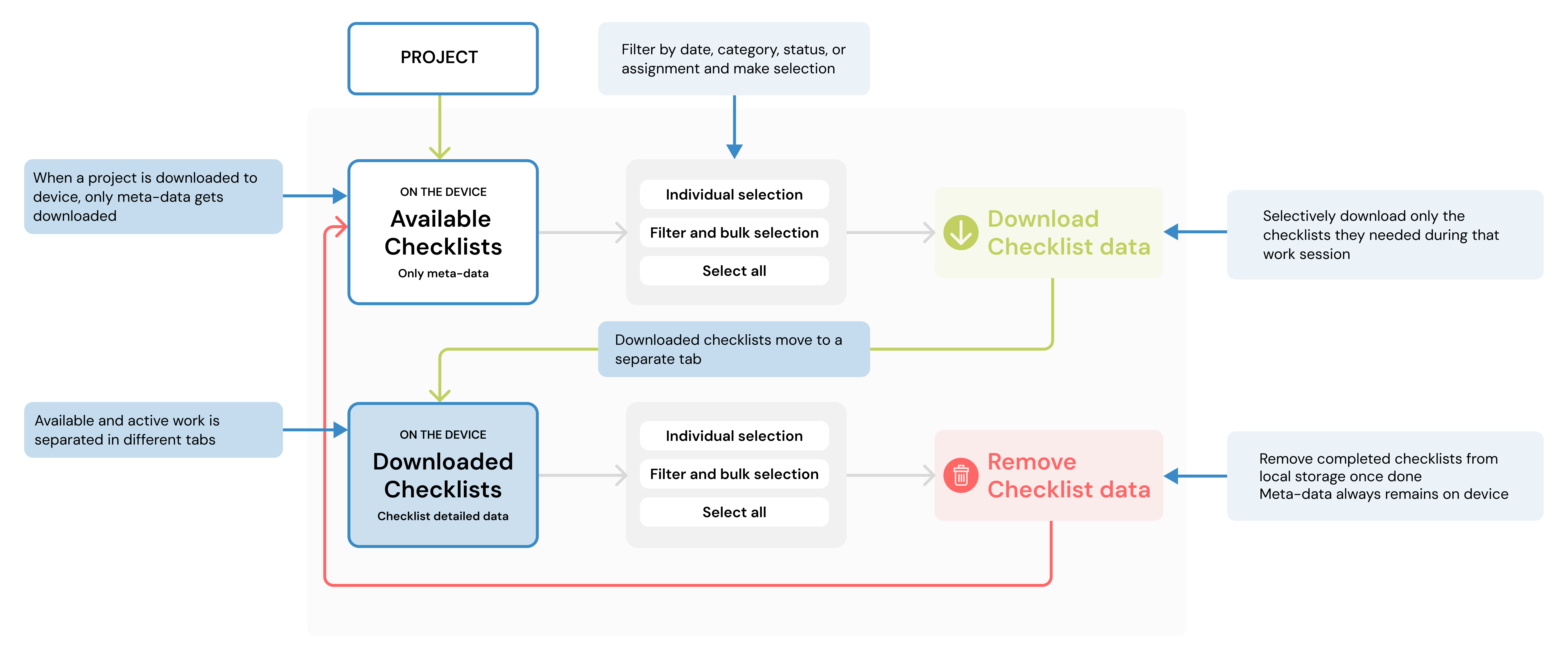
Key interface decision: tabs over accordion.
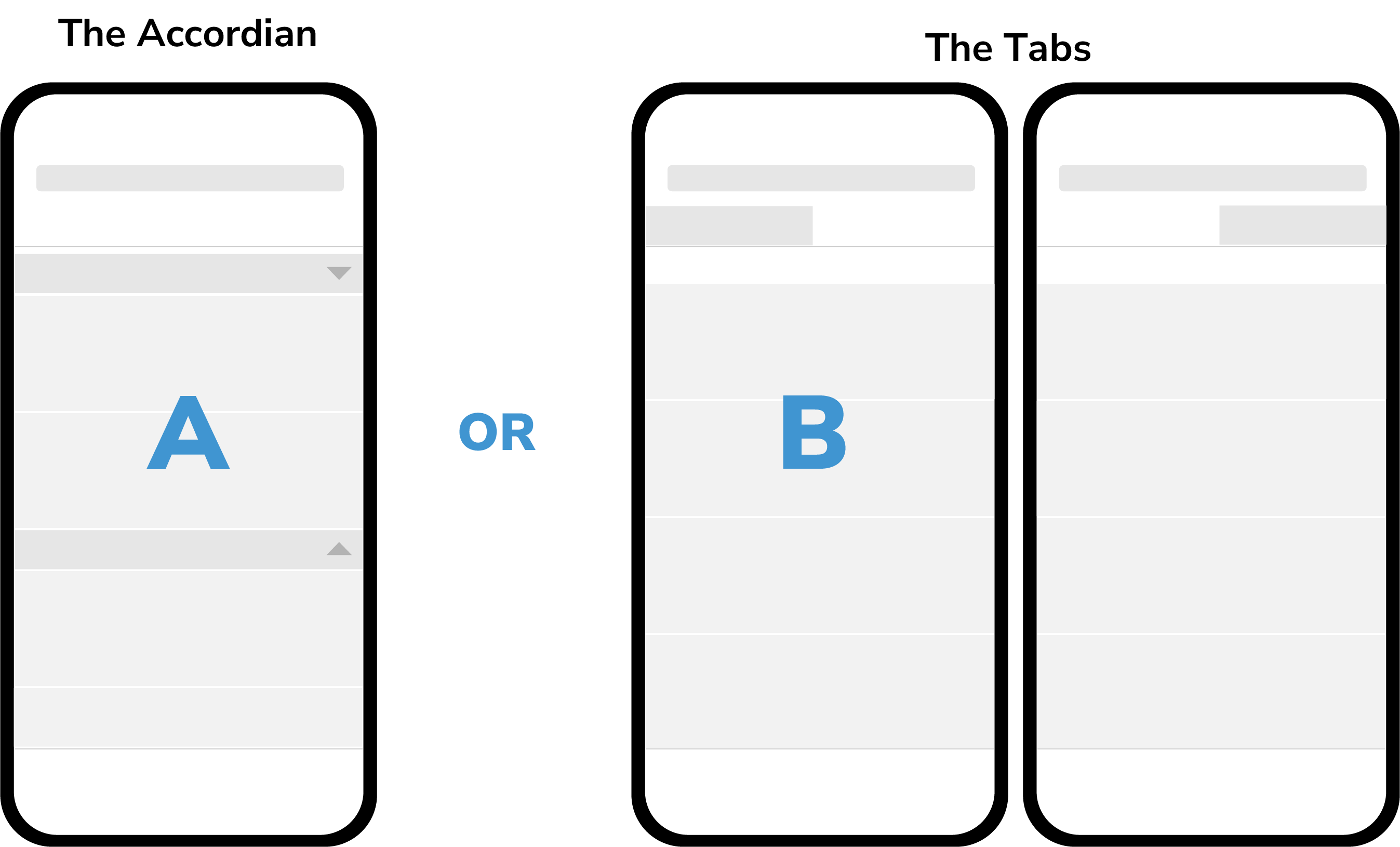
After rounds of iteration, the team narrowed to two directions — an accordion model and a tab-based model. We reviewed both with engineering to understand the front-end scope, then tested both with CSMs. The tab interface was selected after the feedback as,
1. It utilized the screen space on both mobile and tablet efficiently.
2. Visually the structure of checklist card view remained the same — the users could quickly adapt the new feature.
Deliverables
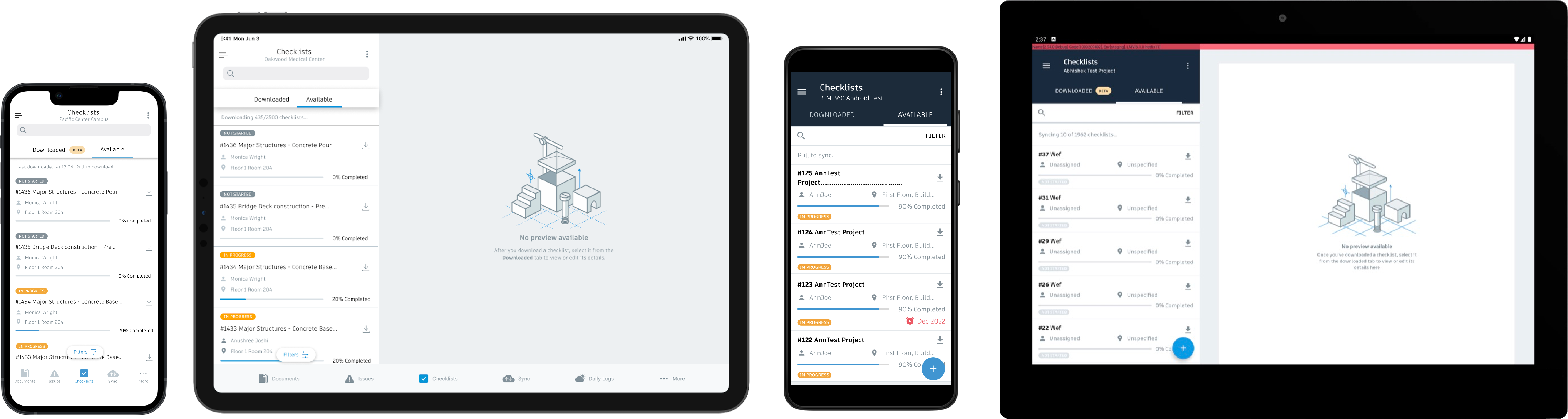
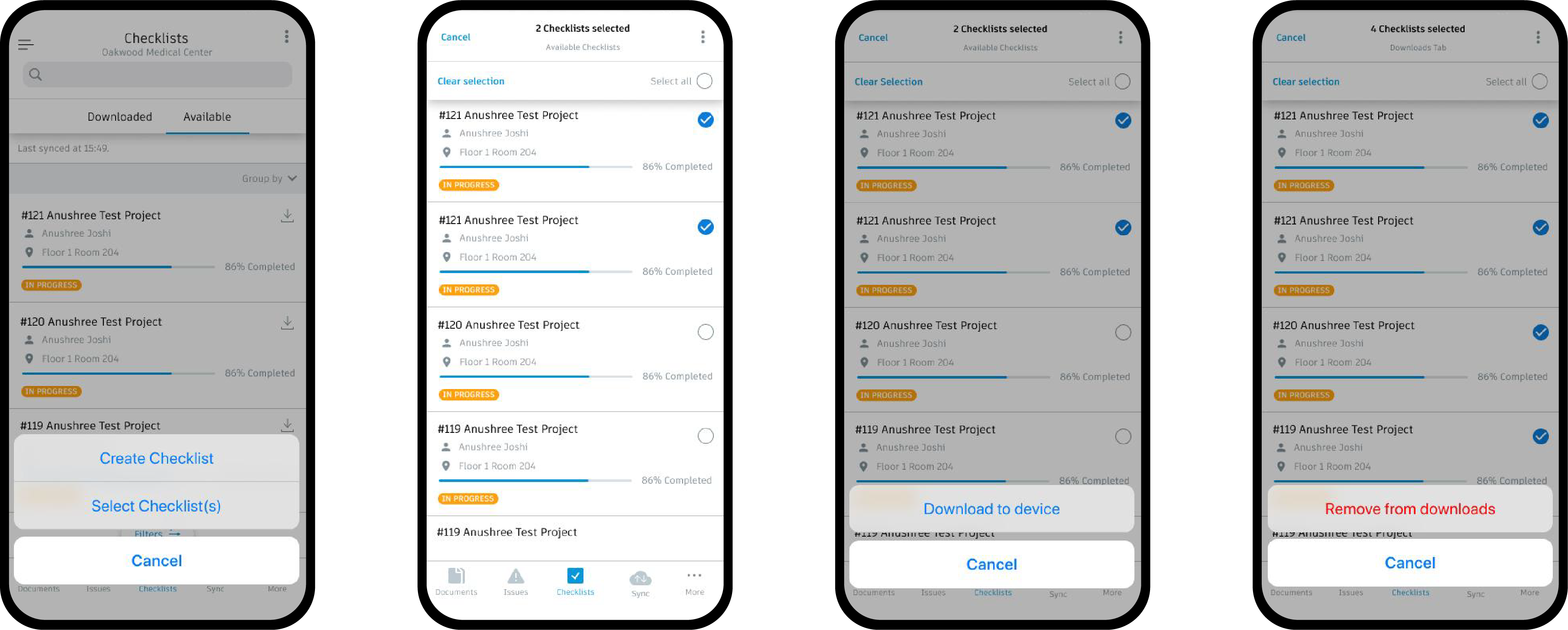
Impact
Project download time reduced
55mins → 10mins
(70-80% reduction)
Storage consumption reduced
1.8GB → 628MB
(60-65% reduction)
Reflections
Content coming soon.
View other projects
Expanding & Sustaining the CAPABLE, a national Aging-in-Place Program
Systems mapping and visual models to surface scaling opportunities for a national non-profit aging-in-place program.
Re-imagining Tele-comm services for Taiwanese Gen Z
A six-week design investigation into Taiwanese Gen Z's digital behaviors and needs to help FarEasTone create a meaningful connection with this coming of age, digital-native generation.